Round App Design
This guide is about designing round apps. For advice on implementing a round design in code, read Round App UI.
With the release of the Chalk platform, developers must take new features and limitations into account when designing their apps. New and existing apps that successfully adapt their layout and colors for both Aplite and Basalt should also endeavor to do so for the Chalk platform.
Minor Margins
The Pebble Time Round display requires a small two pixel border on each edge, to compensate for the bezel design. To this end, it is highly encouraged to allow for this in an app's design. This may involve stretching a background color to all outer edges, or making sure that readable information cannot be displayed in this margin, or else it may not be visible.
Avoid thin rings around the edge of the display, even after accounting for the two pixel margin as manufacturing variations may cause them to be visibly off-center. Instead use thick rings, or inset them significantly from the edge of the screen.
Center of Attention
With the round Chalk display, apps no longer have the traditional constant
amount of horizontal space available. This particularly affects the use of the
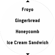
MenuLayer. To compensate for this, menus are now always centered on the
highlighted item. Use this to display additional information in the cell with
the most space available, while showing reduced content previews in the
unhighlighted cells.
Menus built using the standard cell drawing functions will automatically adopt
this behavior. If performing custom cell drawing, new APIs are available to
help implement this behavior. For more information, look at the Graphics
documentation, as well as the menu_layer_set_center_focused() and
menu_layer_is_index_selected() to help with conditional drawing.
Pagination
Another key concept to bear in mind when designing for a round display is text
flow. In traditional Pebble apps, text in ScrollLayer or TextLayer
elements could be freely moved and scrolled with per-pixel increments without
issue. However, with a round display each row of text can have a different
width, depending on its vertical position. If such text was reflowed while
moving smoothly down the window, the layout would reflow so often the text would
be very difficult to read.

The solution to this problem is to scroll through text in pages, a technique
known as pagination. By moving through the text in discrete sections, the text
is only reflowed once per 'page', and remains easily readable as the user is
navigating through it. The ScrollLayer has been updated to implement this
on Chalk.
To inform the user that more content is available, the Chalk platform allows use
of the ContentIndicator UI component. This facilitates the display of two
arrows at the top and bottom of the display, similar to those seen in the
system UI.
A ContentIndicator can be created from scratch and manually managed to
determine when the arrows should be shown, or a built-in instance can be
obtained from a ScrollLayer.
Platform-Specific Designs
Sometimes a design that made sense on a rectangular display does not make sense on a circular one, or could be improved. Be open to creating a new UI for the Chalk platform, and selecting which to use based on the display shape.
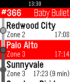
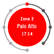
For example, in the screenshot below the linear track display was incompatible with the round display and center-focused menus, leading to a completely different design on Chalk that shows the same information.
basalt
chalk
What's Next?
Read Example Implementations to learn how to use and implement the UI components and patterns encouraged in SDK 3.x apps.